ING ORANGE LAB · BRANDING + SPACE
Truly digital, yet beautiful.
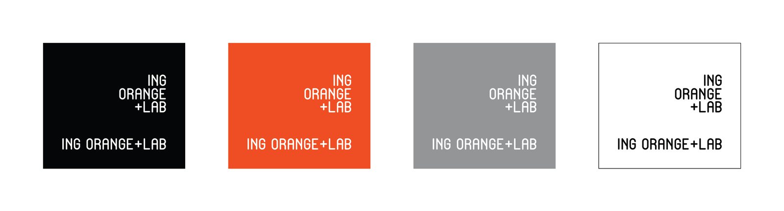
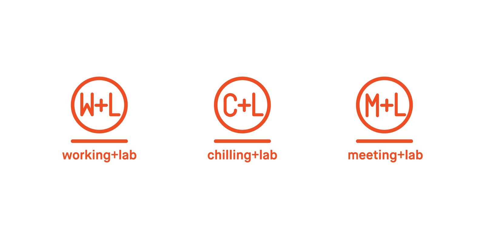
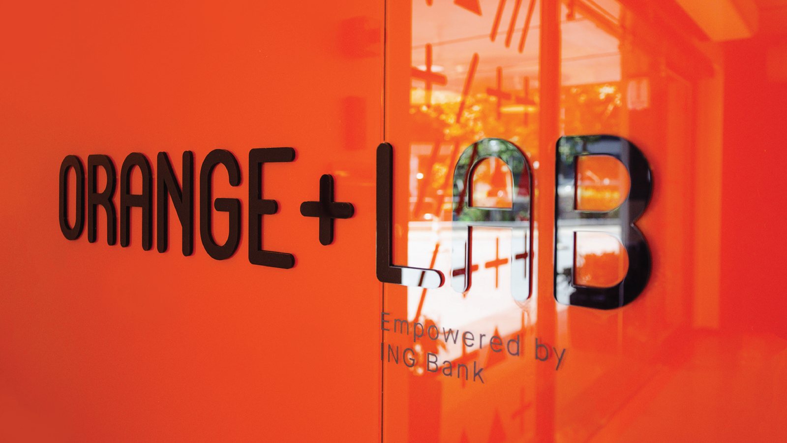
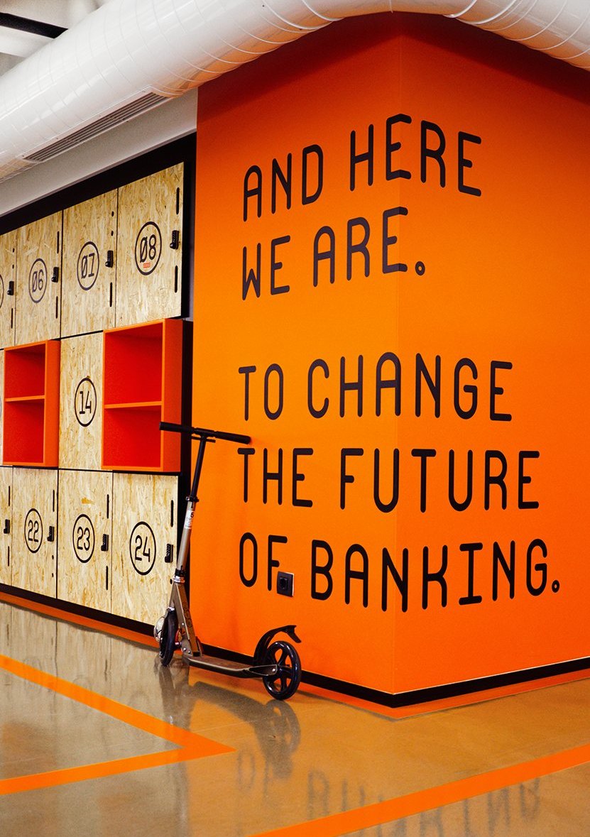
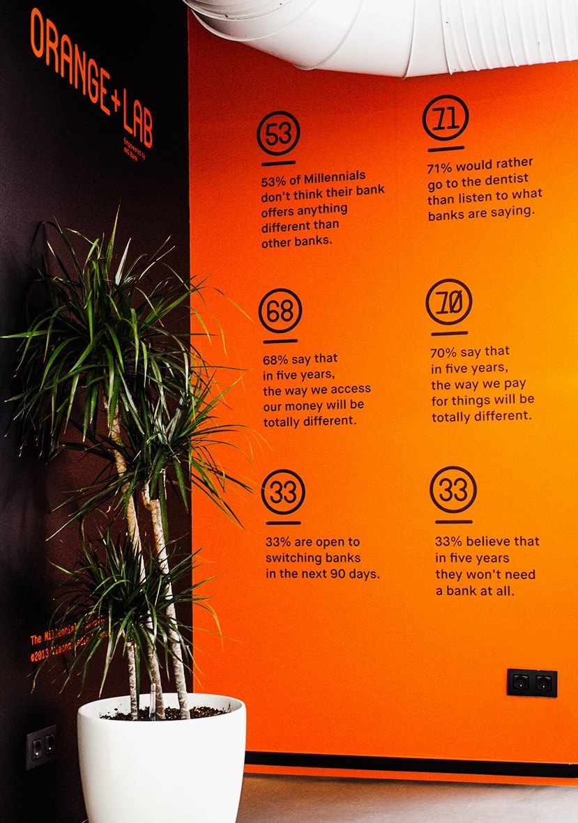
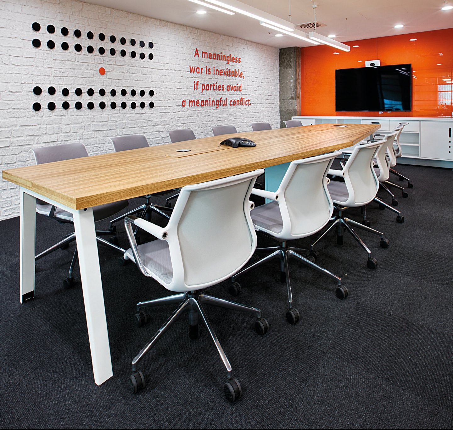
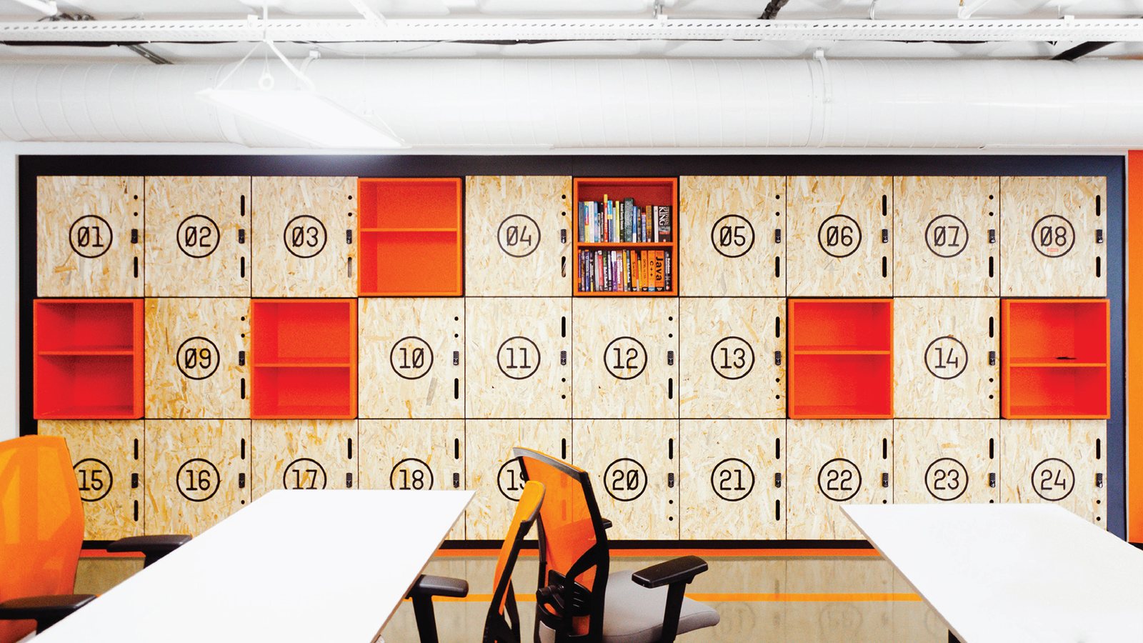
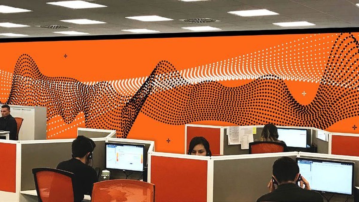
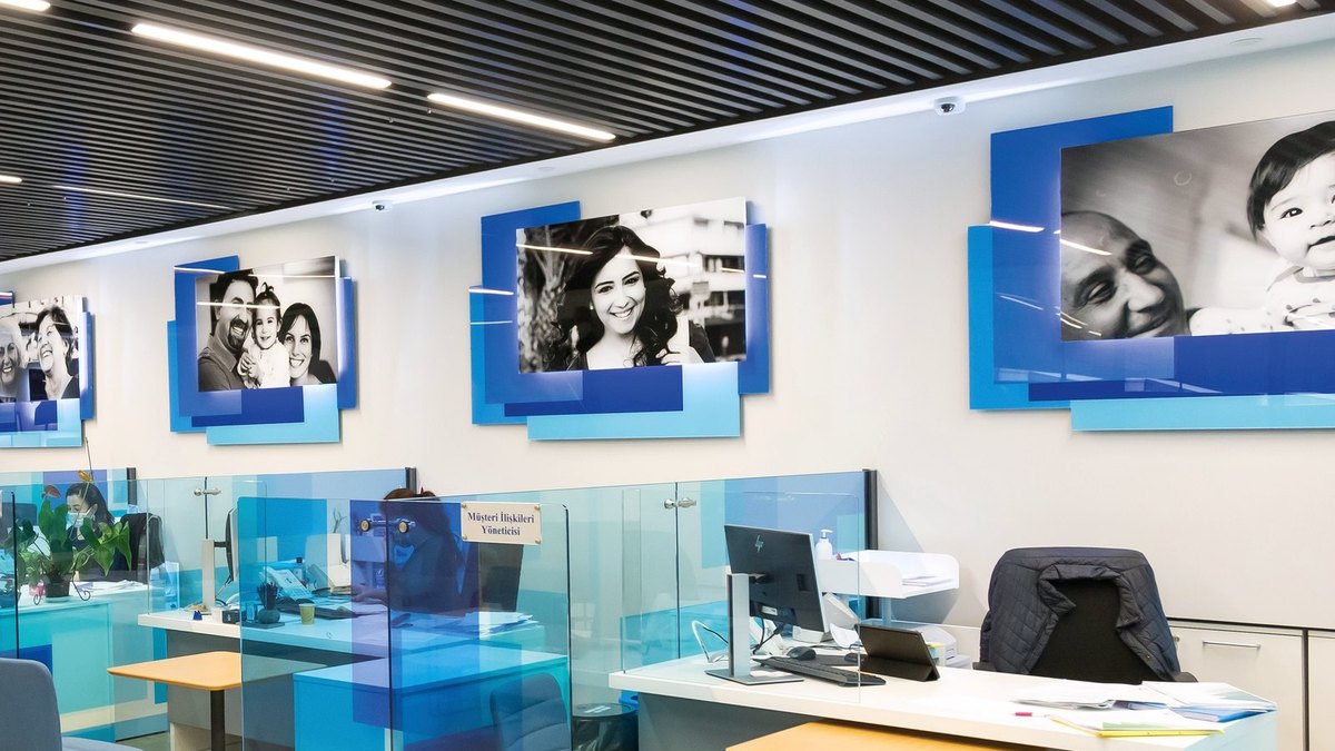
For ING Bank's fintech division we did it all: found the name, built the visual identity, drew a unique typeface and designed the branded space. Orange Lab was launched with its own manifesto, its own font and a wonderful atmosphere, met with great success and admiration. The target audience: Generation Z. Highly intelligent, smart and digital, which gave us the opportunity to be bold, brave and original.
A LANGUAGE OF THREE SYMBOLS
Bold, brave and original.
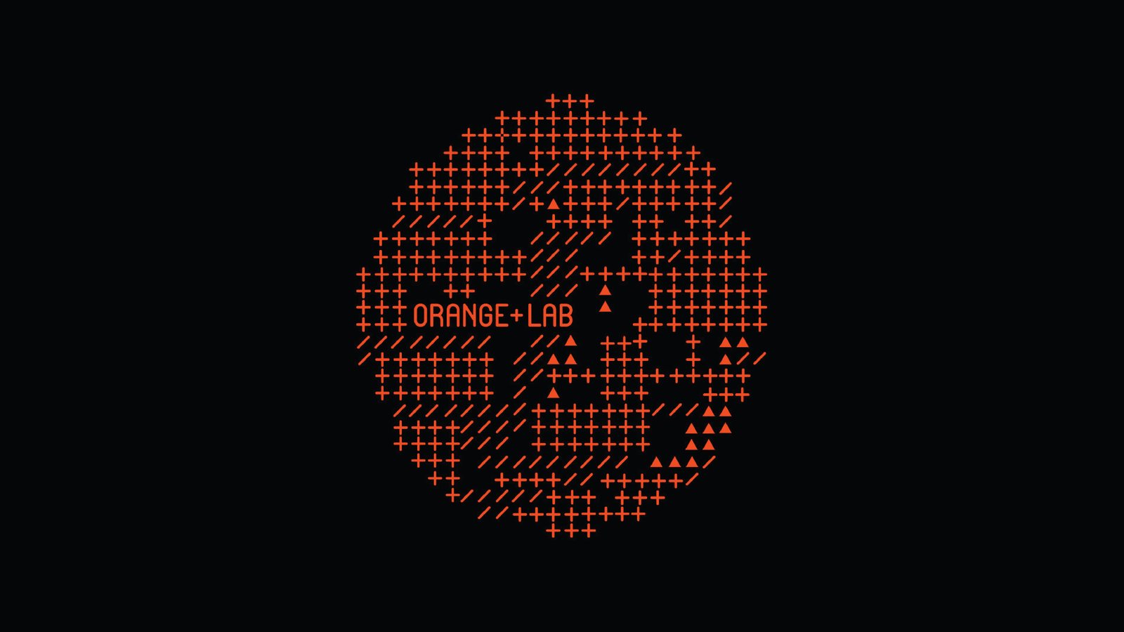
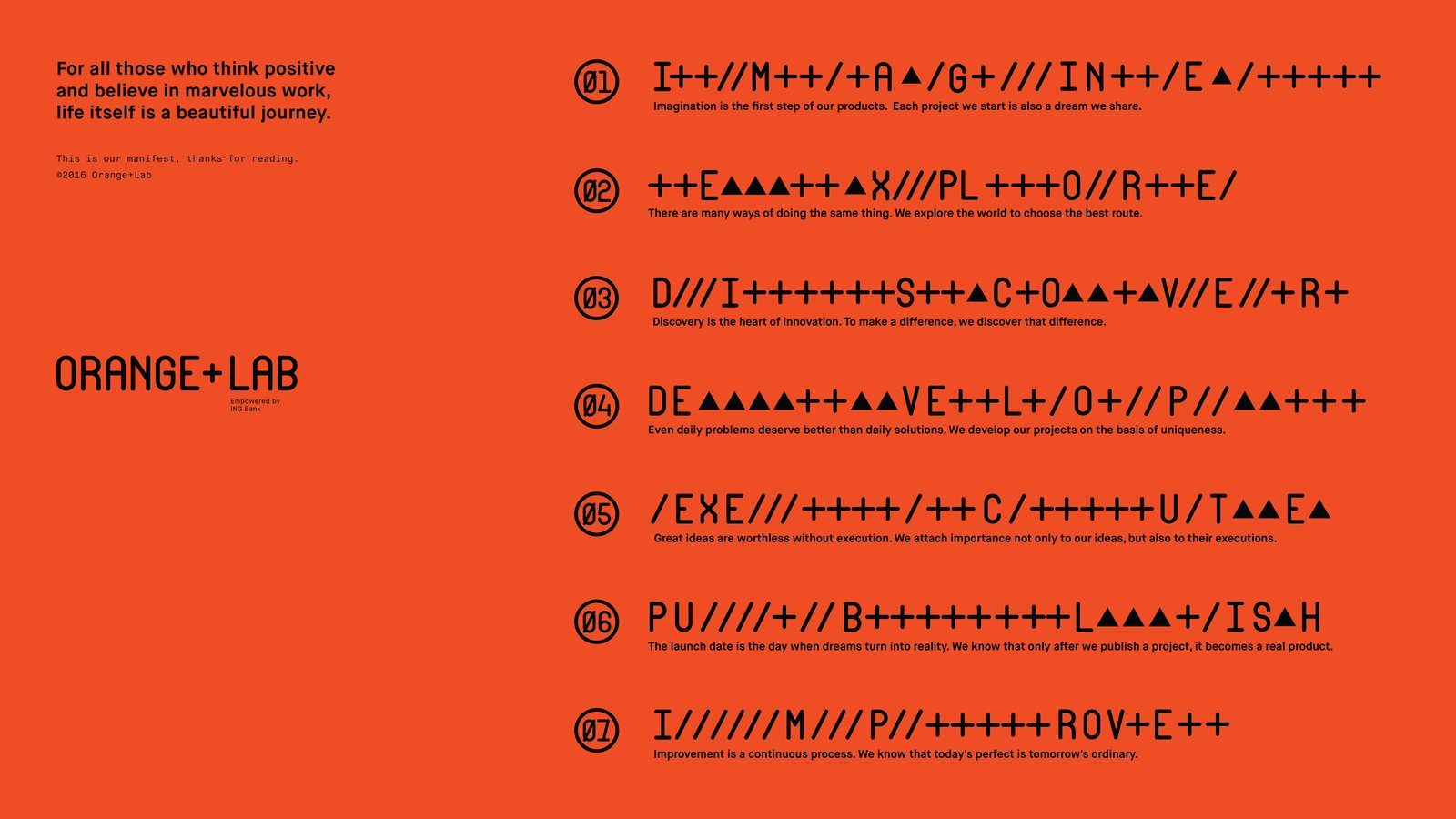
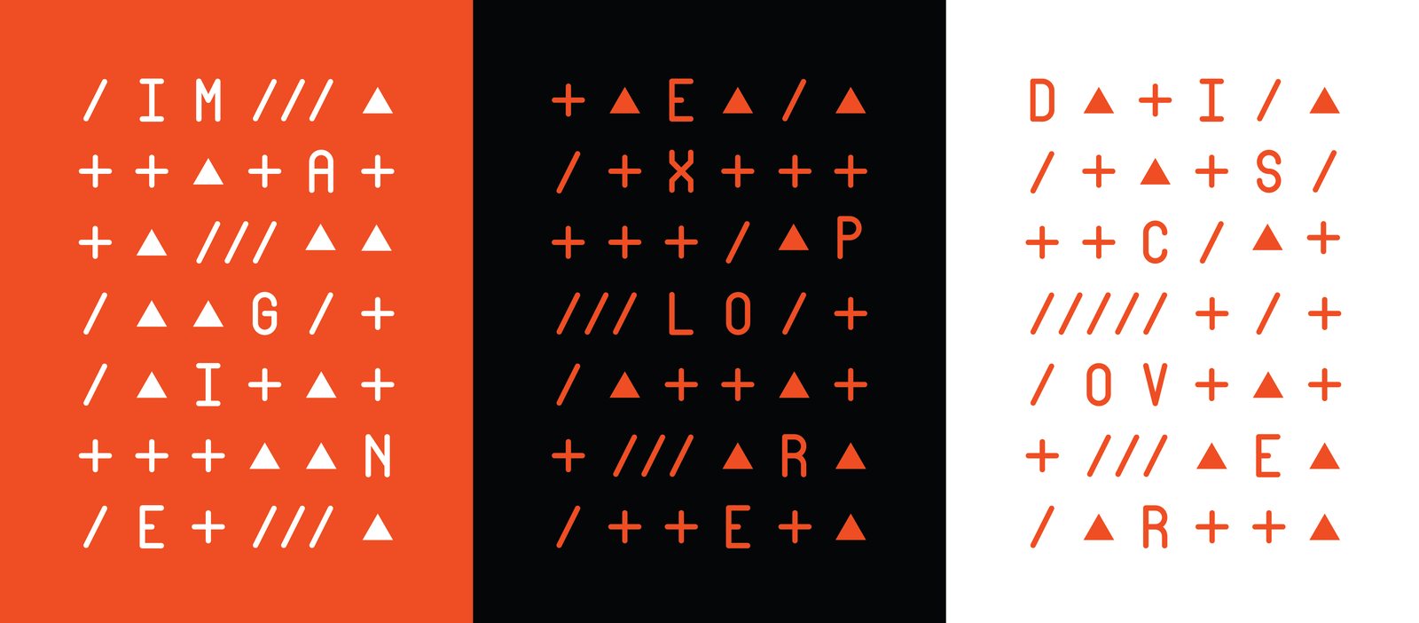
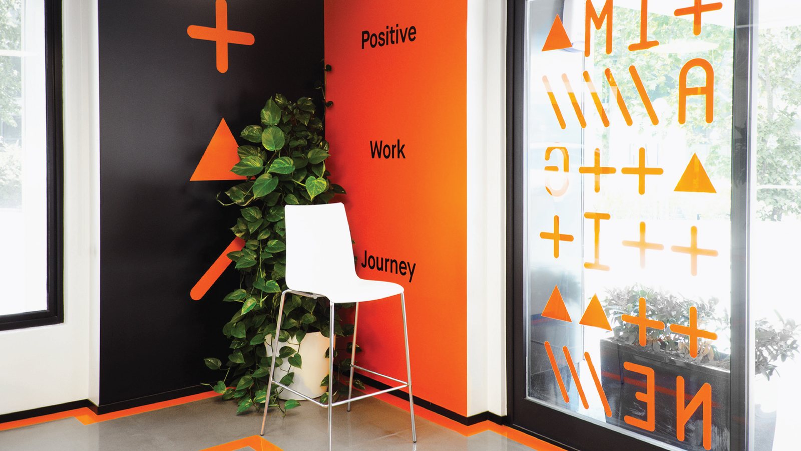
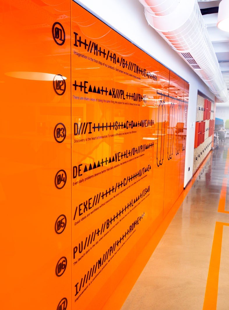
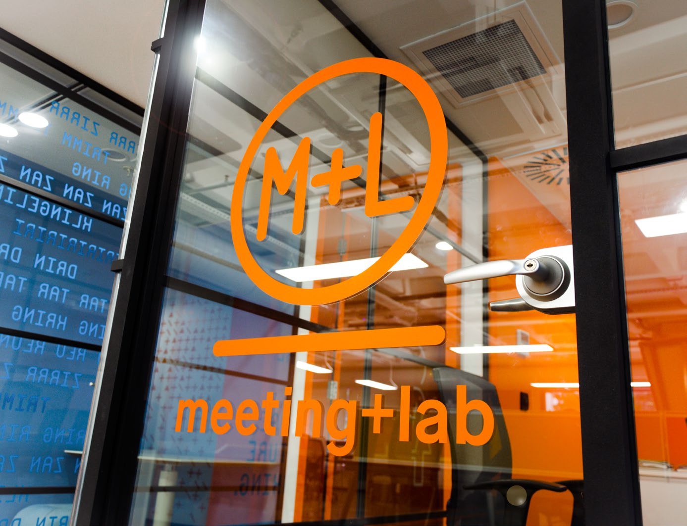
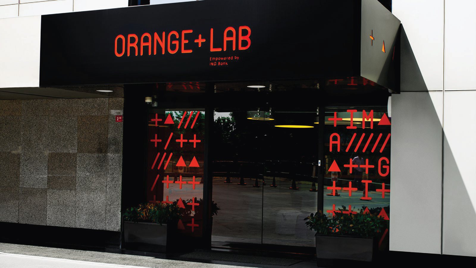
A unique typeface, a manifesto written in code, and a space that behaves like a screen: phone booths ringing in eleven languages, a graffiti container café, windows to be deciphered like huge monitors. Truly, we enjoyed and had fun at every part of the project.
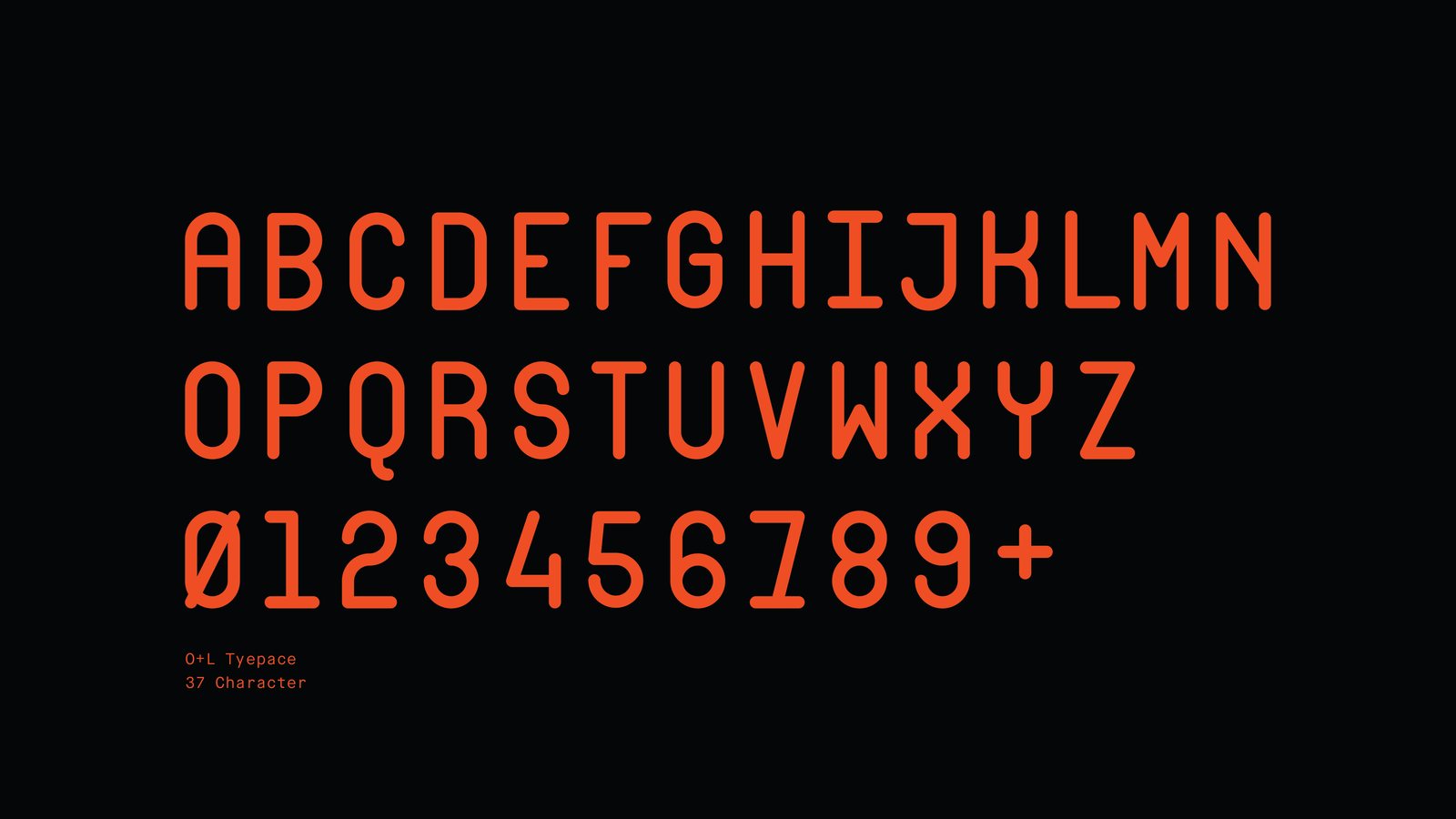
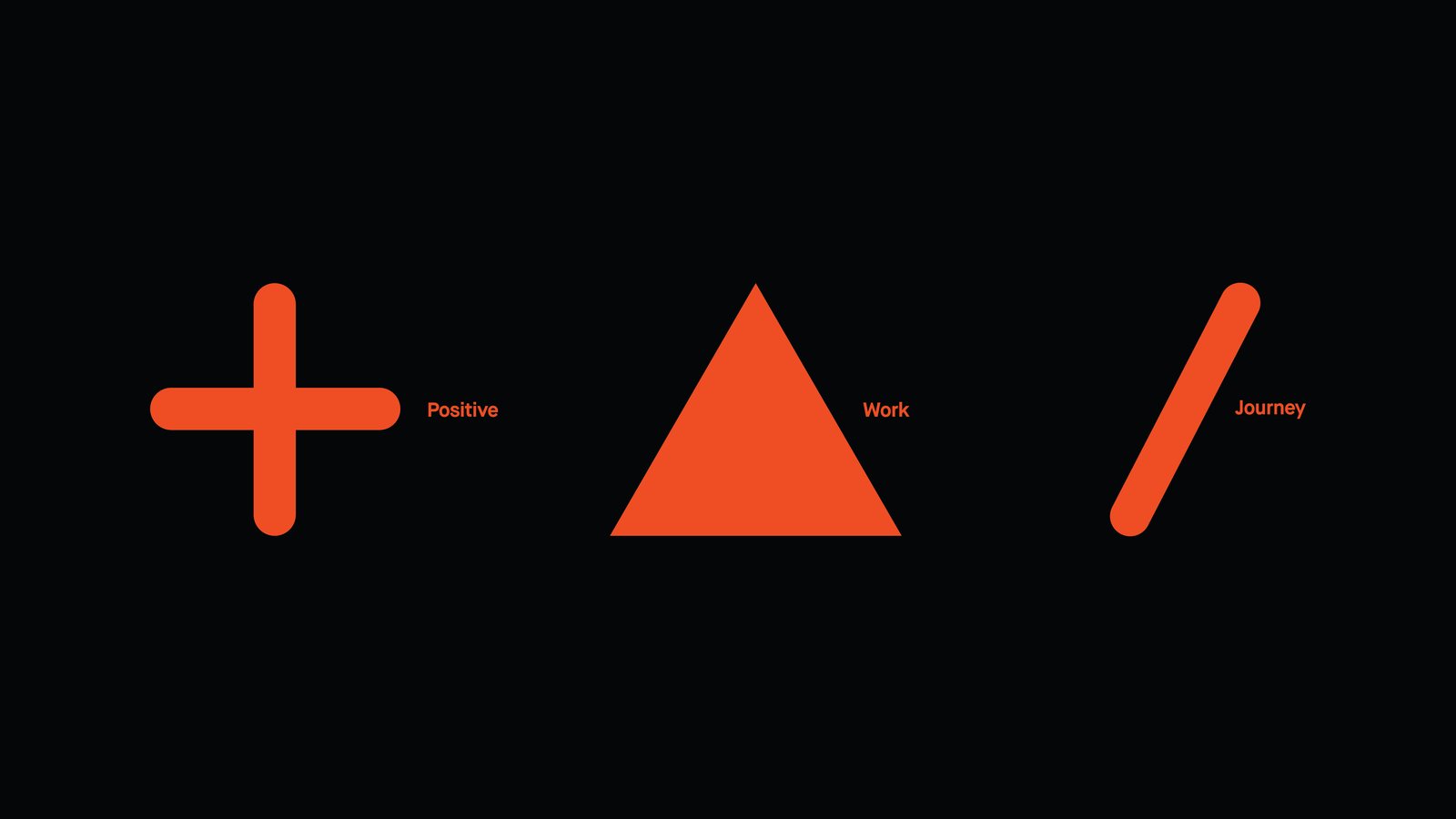
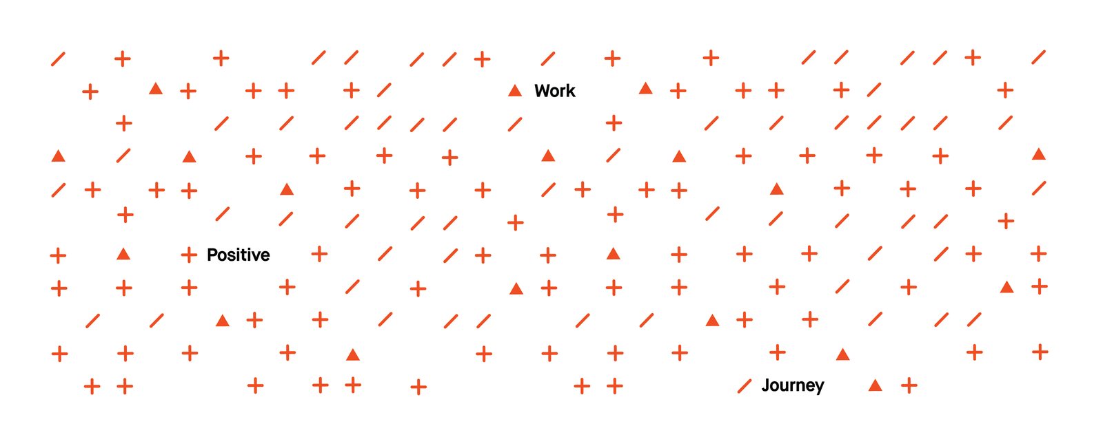
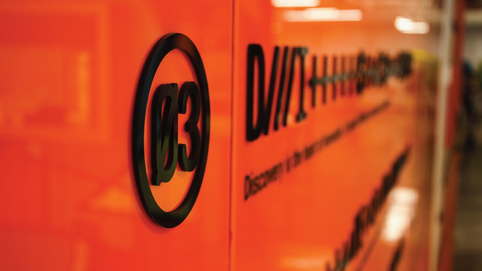
The typeface, O+L, has exactly 37 characters: the alphabet, the numerals and a plus sign. The plus, the triangle and the slash stand for positive, work and journey, and they spell out the manifesto in a code of their own.
ENTRUSTED ONCE AGAIN
The language of code, as a space.
We must have done a good job with the headquarters, because ING Bank came back to us, this time for the naming, branding, corporate identity and spatial design of its newly founded incubation center, envisioned as a hub for digital innovation.
In response, we set out to translate the language of coding into a unique visual identity and spatial atmosphere, tailored specifically for this new space.